Date: December 2021
Project: Visual Identity
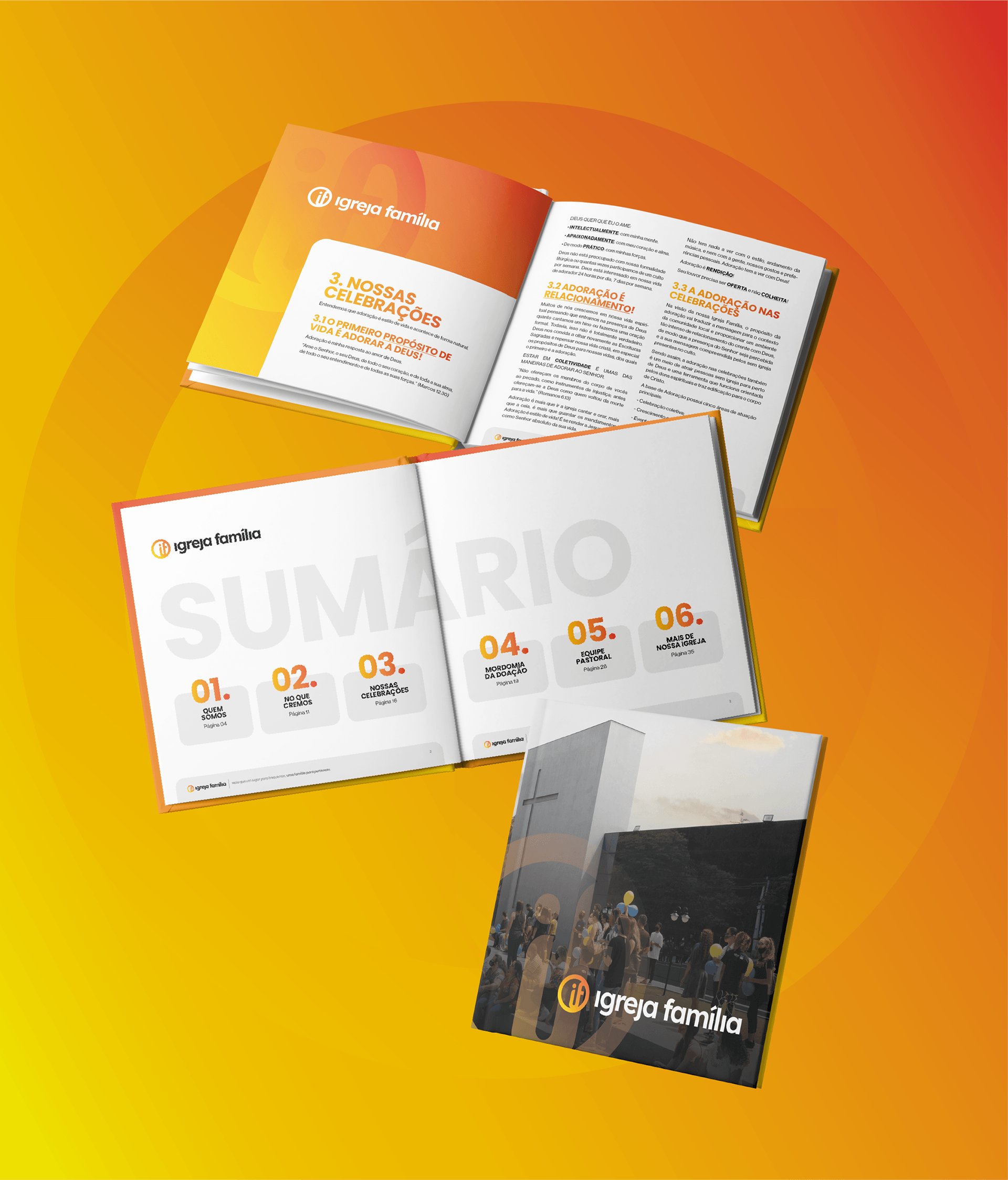
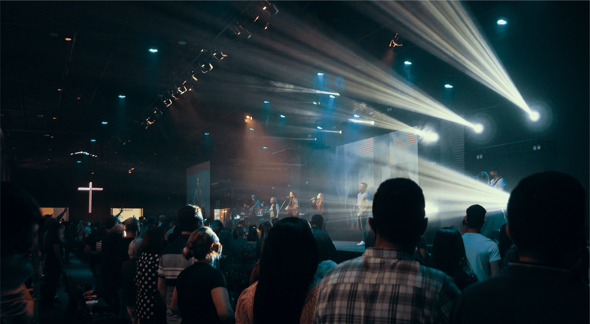
Igreja Família is a church located in the interior of São Paulo. The project involved a repositioning of the former IBIS - Sorocaba Baptist Church. With the goal of making a long-standing positioning a reality, a new visual identity project was carried out in conjunction with the naming process.
A Igreja Família é uma marca de uma igreja do interior de São Paulo. O projeto foi um novo posicionamento da antiga IBIS - Igreja Batista de Sorocaba. Com o objetivo de tornar real um posicionamento de anos, foi realizado um novo projeto de identidade visual junto ao naming.
About the Project
Concept
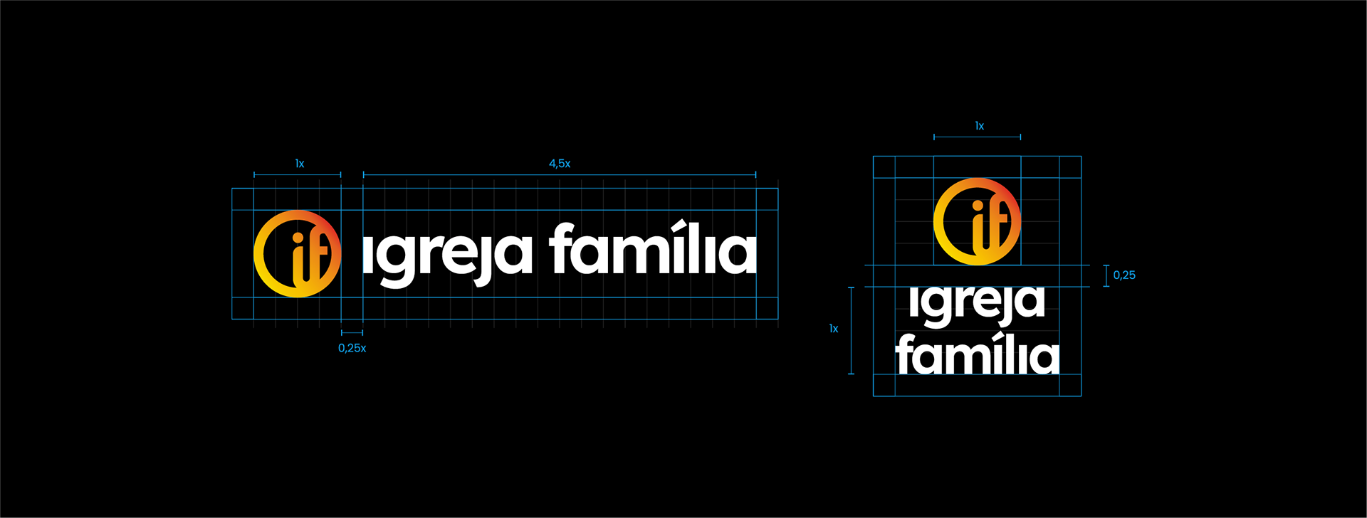
As a solution, the visual identity created for the Family Church embodies a modern, technological, and sophisticated brand, representing everything the church stands for to a diverse audience. As a result, we aimed for a sober yet vibrant identity, expressing the warmth of a family while maintaining a serious tone—a balance that a large family needs to have.
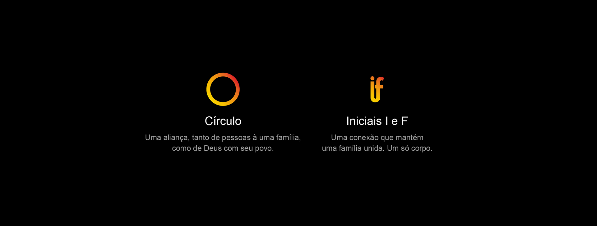
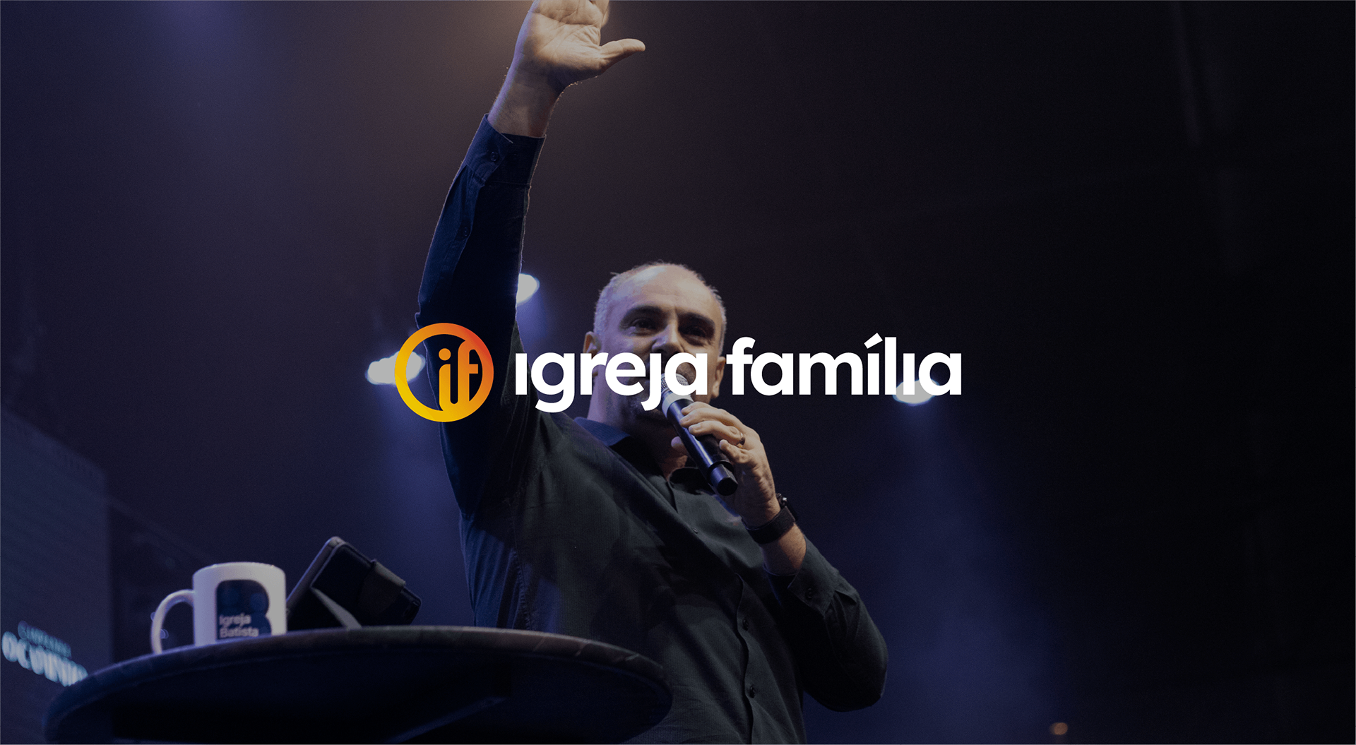
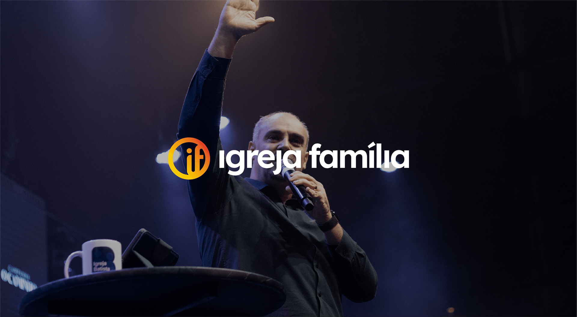
In the symbol, the circle represents the alliance, both among people within a family and between God and His people, while the initials I and F symbolize the connection that keeps the family together. The range of gradients was created to represent the diversity that a large family can have, with orange serving as the primary color to express the energy that the brand embodies.
Como solução, a identidade visual criada para a Igreja Família expressa uma marca moderna, tecnológica e sofisticada, tudo o que a igreja representa, para um público com muita diversidade. Como resultado, objetivemos uma identidade sóbria e muito vibrante, expressando o calor de uma família, ao mesmo tempo que se mantém séria. Um equilíbrio que uma grande família precisa ter.
No símbolo, o círculo representa a aliança, das pessoas à uma família e também a de Deus com seu povo, e as iniciais I e F é a conexão que mantém a família unida; A variedade de gradientes foi criada para representar a diversidade que uma grande família pode ter. O laranja sendo como a principal, por expressar a energia que a marca tem.